
Filter by
SubjectRequired
LanguageRequired
The language used throughout the course, in both instruction and assessments.
Learning ProductRequired
LevelRequired
DurationRequired
SkillsRequired
SubtitlesRequired
EducatorRequired
Results for "plotly"

Coursera Project Network
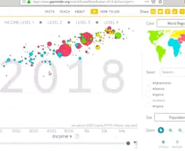
Skills you'll gain: Plotly, Exploratory Data Analysis, Scatter Plots, Plot (Graphics), Data Visualization Software, Statistical Visualization, Interactive Data Visualization
Coursera Project Network
Skills you'll gain: Plotly, Interactive Data Visualization, Data Visualization Software, Scatter Plots, Ggplot2, Exploratory Data Analysis

Vanderbilt University
Skills you'll gain: Data Storytelling, ChatGPT, Excel Macros, Excel Formulas, Microsoft Excel, Data Visualization, Data Analysis, Presentations, Generative AI, Artificial Intelligence, Data Cleansing, Data Import/Export, Data Integration, Productivity Software, Data Transformation, Data Validation, Exploratory Data Analysis, Creative Thinking, Creativity, Natural Language Processing

Skills you'll gain: Plotly, Dashboard, Data Visualization Software, Interactive Data Visualization, Cascading Style Sheets (CSS), Hypertext Markup Language (HTML), Jupyter, UI Components, Python Programming, Real Time Data, Pandas (Python Package), Data Manipulation
Coursera Project Network
Skills you'll gain: Plotly, Histogram, Interactive Data Visualization, Scatter Plots, Data Visualization

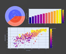
Skills you'll gain: Data Visualization Software, Plotly, Data Visualization, Dashboard, Interactive Data Visualization, Matplotlib, Seaborn, Data Analysis, Geospatial Information and Technology, Pandas (Python Package), Scatter Plots, Histogram, Heat Maps, Box Plots

Coursera Project Network
Skills you'll gain: Plotly, Datamaps, Interactive Data Visualization, Data Visualization Software, Scatter Plots, Jupyter, Epidemiology, Python Programming, Exploratory Data Analysis, Data Analysis, Medical Science and Research
Coursera Project Network
Skills you'll gain: Matplotlib, Box Plots, Plot (Graphics), Seaborn, Data Visualization Software, Pandas (Python Package), Scatter Plots, Data Presentation, Data Import/Export, Histogram, Python Programming, Data Manipulation

Duke University
Skills you'll gain: Data Visualization Software, Data Visualization, Data Storytelling, Interactive Data Visualization, Plotly, Matplotlib, Dashboard, Seaborn, Tableau Software, Scatter Plots, Spreadsheet Software, Histogram, Google Sheets, Microsoft Excel, Business Intelligence Software, Pandas (Python Package)

Coursera Project Network
Skills you'll gain: Exploratory Data Analysis, Box Plots, Plot (Graphics), Ggplot2, Data Visualization Software, Statistical Visualization, Scatter Plots, Histogram
 Status: Free
Yale University
Skills you'll gain: Behavioral Economics, Storytelling, Data Storytelling, Economics, Economic Development, Financial Forecasting, Socioeconomics, Forecasting, Social Studies, Consumer Behaviour, Analysis, Complex Problem Solving

Skills you'll gain: Plotly, Exploratory Data Analysis, Predictive Modeling, Interactive Data Visualization, Data Science, Data-Driven Decision-Making, Data Storytelling, Data Presentation, Data Analysis, Pandas (Python Package), Web Scraping, Statistical Machine Learning, Data Wrangling, Data Collection
In summary, here are 10 of our most popular plotly courses
- Data Visualization using Plotly: Coursera Project Network
- Data Visualization with Plotly Express: Coursera Project Network
- ChatGPT + Excel: AI-Enhanced Data Analysis & Insight: Vanderbilt University
- Python Interactive Dashboards with Plotly Dash: Packt
- Crash Course on Interactive Data Visualization with Plotly: Coursera Project Network
- Data Visualization with Python: IBM
- Covid-19 Death Medical Analysis & Visualization using Plotly: Coursera Project Network
- Plots Creation using Matplotlib Python: Coursera Project Network
- Data Visualization with Python: Duke University
- Data Visualization using Plotnine and ggplot: Coursera Project Network


